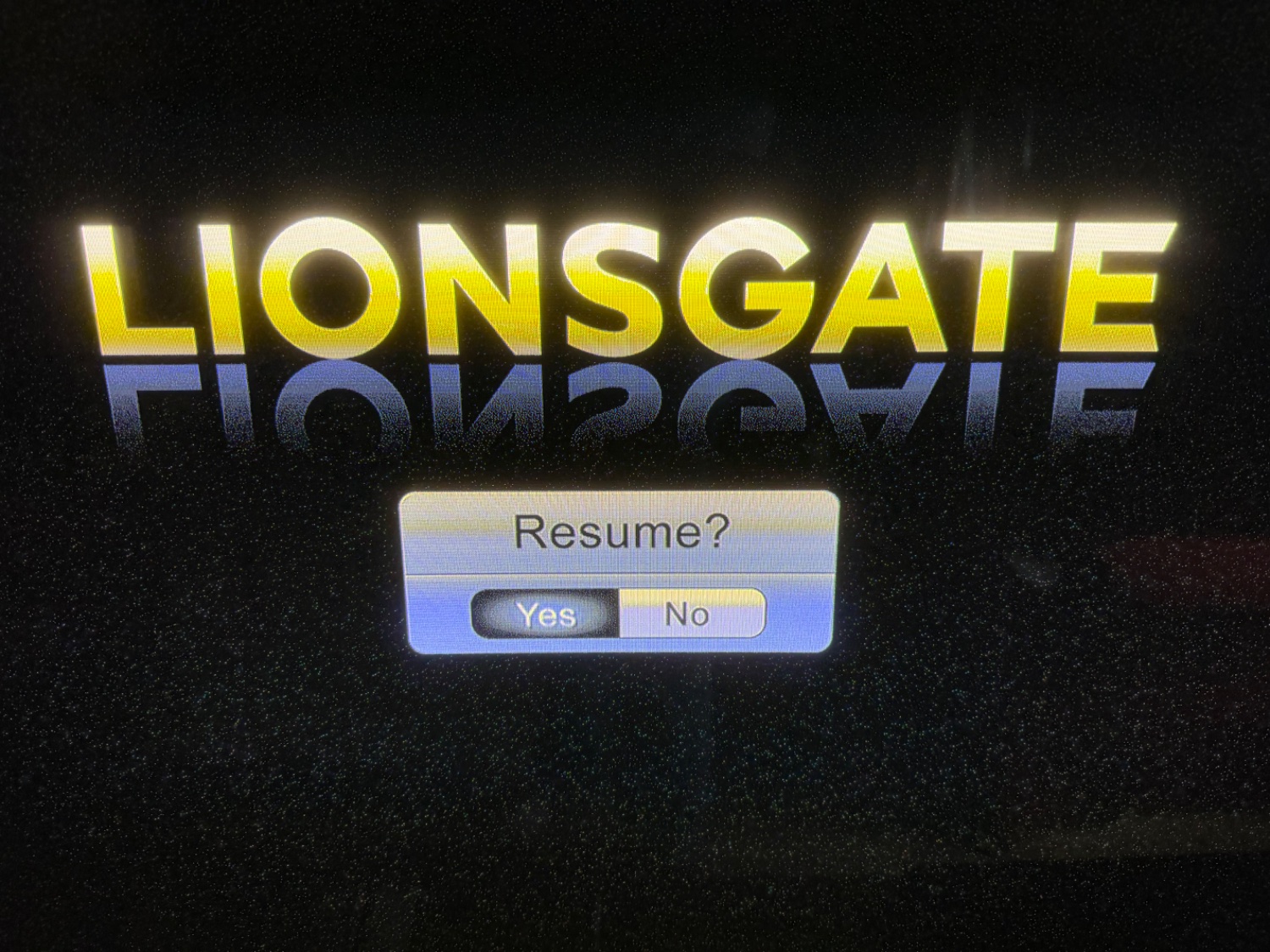
If you're genuinely asking... the yes option. But that is indeed a shitty ass UI.
My answer comes from the "thumb print" effect - that radial shadow pattern is supposed to remind the user of their finger partially blocking the light on an illuminated button.
I think the radial shadow pattern is actually supposed to evoke the edges of the hollow in which the button is depressed, but otherwise I agree with you 100%.
Also the "no" has the yellow reflection from the graphic above, implying its projecting out.
You should post this in the group assholedesign. This is genuinely so bad it’s infuriating.
Really? Literally everyone in this thread figured it correctly as yes. So it's really not that bad.
How anyone developing an interface thinks that is a good idea is beyond me, but I am convinced they are doing multiple lines every morning.
•
Not a great UI but honestly the yes looks pressed in the 3d meaning of the word.
So it's not terrible
•
I think that might be because modern UI tends to move away from 3d and insted highlights the selected button (making it lighter in color)
Yeah I think that's the problem here. Older uis leant into the faux 3d thing whereas modern designs are mostly flat/minimal
Fucking of course. Leave it to such a dev to ensure no logical method can work the problem.
Easy, you just press right and see if the option moves.
Oh wait that just toggles between them. I've never used whatever this is, but you know it does.
Actually I had to guess as to the correct answer was. I guessed wrong and the movie started over
The one that always gets me is GNOME's screen sharing portal.
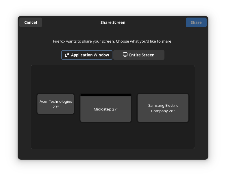
There is this outline around the "Application Window" tab which makes it seem selected. I use this UI multiple times a week and I need to pause for a sec every single time. I always think "I want to share a window", "oh it is already selected" then stare at the monitors for a while before I realize why I can't understand what I am looking at.
•
If they did the exact opposite of this, I think it would look ok. If I was trying to fix this, I would probably just swap the styles of the selected and deselected states. Maybe it's a miscommunication between designers and implementers, causing the meanings to be swapped?
I don't think it is that simple. I think that outline is about the "focus". So if I press enter it will activate that tab, if I press tab it will move the focus to the "Entire Screen" tab.
The UX issue is that there are two concepts of focus in this UI. There is "which tab is active" and "what UI element will pressing enter activate". These two are not sufficiently differentiated which leads to a confusing experience.
Or maybe there can just be no keyboard focus indicator by default, but that may be annoying for keyboard power users. But this is generally how it works on the web, you have to press tab once to move keyboard focus to the first interactive element.
•
Right, that makes sense as well. What I was thinking is that the use of the accent colour shows which one is active, though it would probably be less confusing if this wasn't done with an outline. See the KDE version for example:
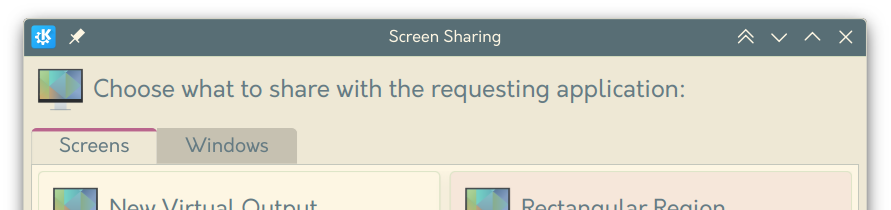
Regarding keyboard navigation, I could see this working similarly to radio buttons, where the tab key selects the entire tab group, and tabs need to be navigated using the arrow keys. In this case I think it makes sense to put the focus border around only the selected option, and having the focus border follow the selected option when arrow keys are used. If this is the case, I think swapping the current version does make sense.
Yup. But at least I had set a bookmark. Although the interface for selecting a bookmark isn't any better.
I'd say yes, but I did have to look at it closely. Plus the assumption that it would probably default to continuing.
I think we need to know what the UI looks like before a selection has been made, or what it looks like when the curser is over each option. The 'interface' part is lost by a single screen shot.
When you're not using a pointer interface (mouse or, awkwardly, wii-mote) it's extremely rare for the UI to ever be in a neutral (nothing selected) state. Since you'd always be navigating relatively (go right, down, up, or left) instead of absolutely (go to pixel 753x1034) there always must be some point of reference for that movement.
Once in a blue moon you'll see a menu where your initial selected position is something like "before the first item" so when you press right in a horizontal selector you actually move from nothing selected to the first thing selected and it's almost always a terrible UX. If you set up such an interface you're accepting that every action will require an extra useless click and that users entering the state freshly (i.e. you reach this screen then walk away and your partner is the next person to see it) will be confused about where in the action they are. You're also accepting responsibility for what will happen if the user confirms without ever actually making a selection which will usually require some (again, utterly unnecessary) dialog box asking the user to try again but this time actually select an action.
Relative navigation having a neutral/unselected state is almost always a mistake.
No selection was made by me. It showed up with one of them being white and one being black. Can't remember which side was which. But keep pressing left on the remote and they just cycle back and forth. This is on a bluray player.