Stare into the lamp and it'll stare back
Edit: also, u crazy, its just a lamp! —Ikea guy
I've been reading a dark mode book on an OLED screen and it's such a treat. The background is pitch black but I crank the brightness up so there is a high contrast and the white letters look really sharp. It actually makes it easier to read
I use my e-reader’s dark mode when I am reading in the dark and the backlight is on. So, in the one instance where it is actually emitting light.
Even with the "backlight" it's far less harsh than an LCD or OLED panel because it's not actually a back light, e-ink display have a "frontlight" that actually directs the light back at the display instead of from behind it facing outward towards the user
•
FYI ereaders don't emit light even with the light on. They use lights hidden on the sides under the bezels, and that light gets distributed above the screen using a kind of gel layer. The screen then reflects that light back.
Isn’t the device emitting light though, if not the screen itself? I don’t know if there is a technical definition of “emit” that is narrower, but I just meant that there is one time where the device itself is the brightest thing in the room and dark mode reduces that.
•
Yeah I guess that's fair, but I think that the fact that the light isn't directly shining in your eyes but is reflected, makes quite a difference. Still, use whatever mode feels most comfortable to you! Just sharing knowledge.
•
As someone with sensory issues, absolutely they do. I used to struggle so hard in school when I was supposed to stare at white paper in a well-lit room. I'm not sure if most people notice just how fucking bright paper can be xD
Yeah for whatever reason, textbook paper always has a glossy finish to it. Combine that with bright overhead fluorescent lights in a school and I could see how that could be irritating as fuck.
Other types of written material don't seem to have a glossy sheen like works of fiction and dictionaries. Do you still have issues with those or no?
•
I'm with you. I've been using invert colors before dark mode became cool. If only I could do it in real life...
That's it, downvote the guy even though he is right: https://www.pa.uky.edu/~sciworks/light/preview/color4aa.htm#:~:text=White%20objects%20look%20white%20because,wavelengths%3B%20the%20rest%20they%20absorb.
Plus doing dark mode with a physical book requires a crap ton of ink - it would be very wasteful.
•
I think the point is that reflecting is ultimately just a form of emitting
it's possible to have harsh brightly lit white paper, as well as dim white screens
White paper and black text is the norm because until relatively recently, it was much more cost effective... This could be done cheaply with modern tech, and should 100% be a thing...
I'd buy the hell out of dark mode books.
That question was just as stupid as that "you wouldn't download a car" ad. Hell yeah, I would! And read dark mode books!
Its context was that it was a plea from media companies to stop pirating movies/music. Its more “You wouldn’t steal a car, well downloading pirated content is the same”
Ot played during movie previews
I was in college for Computer Science when these ads must have just started because in a Computer Ethics class, I remember the teacher actually using "you wouldn't download a car, would you" argument.
I recall answering... "Would the original owner still have their copy? Yes? Then yes, yes I would download a car." The teacher did not like me.
Bleaching is to mainly remove tannins, to make the paper white, and to stay white over time. It also makes the paper better able to absorb and retain ink. You don't need any of those properties if you're printing in white, because you can't use absorbent type ink in something like this, it won't show well. You could dye in lieu of bleaching (and this might be cheaper actually).
Printing the text is the challenge. The ink has to be on the paper instead of in the paper... The methods required to do that and come up with a quality product have existed for a very long time, but they'd be methods used to create high end things like wedding invitations and greeting cards and not bulk products like books. I believe the first tech that could do this economically at scale was the photocopier (maybe mimeograph?), which basically melts plastic onto the surface, and could apply clear white text onto black paper as easily as black on white.
I would imagine though, that the tech that could do this in the most economically viable way, would be to ablate the text in with lasers, similar to thermal printing. That would actually reduce the consumables used, maybe even by a lot. likely would overall entail much less hazardous/caustic consumables too... Dark mode printing could possibly be incredibly "green" :)
Books don't light up. They reflect light, but it's different. Light mode is like staring into a flashlight, almost literally.
I prefer light mode in light environments and dark mode in dark environments. I find it's easiest on my eyes when the background of the text matches the room ambience. (of course this has to be paired with matching screen brightness)
Poor contrast is what kills your eyes. You should adapt your screen to your environment.
Problem is, not many screens can compete with the of light of a sunlit room for daytime viewing. That makes dark (text) on dim (background) on light (environment) very rough. Even for daytime viewing light (text) on dark (background) on light (environment) can feel better.
But dark (text) on (light) background on light (environment) is excellent if you can accomplish it, since it's only single step of high contrast because your monitor blends into the environment.
•
Remember that in the beginning of computer era there was no dark mode, it was just called a display:

"cumputer" Hmmm... I'm not sure if that's just misspelled, or some clever reference that I've missed.
Books use the color scheme they do because it's cheaper to print black ink on white paper than white ink on black paper. Digital displays don't have that limitation.
Every software needs a "just turn off the pixels that aren't displaying anything" mode for OLED. Way too many "dark modes" are just dark grey which still keeps the background pixels powered.
Yes, because full black/white contrast is harsher on the eyes than a dark grey with white or light-grey text. For power/efficiency, black pixels definitely makes sense, but concerning user experience and eye strain, there are many good reasons certain color palettes are used.
Obviously not every single OLED panel can be tested for this if the manufacturers don't do it themselves, but a few places tested OLED/AMOLED phones and found slate grey is close enough to full black in power savings. Since then I just choose the most visually pleasing theme as some full black themes are really poorly designed.
•
No because the white parts are what will burn in. Black is the off state for OLED. This is also why many apps for Lemmy (and previously reddit) have a dark theme option for OLED devices that uses full black instead of grey so that the pixels not in use are fully off.
Exactly, and because the rest is off you'll notice it earlier. It still depends on how long those pixels are on though. The longer they're on the more they degrade.
If the whole display is on all of the pixels would degrade eventually, but you'll notice it less because they all degrade.
•
If you have the same pixels on all the time then yes you'd have faster burn in. However, since you'd be looking at different text, this degradation would be spread over the different pixels. Not uniformly, but good enough that it doesn't matter for practical usage.
How about we really break the bank and just print an entire black page on white paper.
In all seriousness that's not usable because the ink will have a tendency to bleed and fill the voids that make up the letters.
It takes more energy, and therefore battery, to draw everything but the letters and words.
E-ink actually doesn't as it only uses power when pixels change between black and white and not when it's displaying a static image. E-ink uses the same amount of power rendering white text on black as black text on white. However, white text is more common since e-ink is specifically meant to imitate printed pages, and assuming it's not backlit, also doesn't have nearly as bad eye strain issues when in light mode as a glowing screen does.
It only has to update the parts where the words changed and it only uses the energy to initially change the screen. It literally uses more energy doing full screen wipes (flashing between black and white three or four times) to avoid ghost images. It would significantly reduce the need for a refresh if it was mostly black.
Our eyes are more sensitive to variations in lighter colors after all.
I mean if I could I would. Also books do not emit light that burns my retinas so... moot point
Most ereaders have I reckon as it's rather easy to implement. My Tolino/Kobo also does, although, I don't really see the point with e-ink displays
Pocketbook very recently added it. But most importantly koreader has it (an open source reader app that is available for a lot of devices), so I basically had it before (excluding system menus which was annoying).
Black dye. Really not too bad when you consider that to make paper white it's literally bleached white.
Most books I read are not white, they are more yellowish, so I think they are less dyed and more natural
Lol seriously though, I’ve had so many people look at my phone and are like “JESUS YOU USE LIGHT MODE”
Like it fucking matters what I use lol
There's a comp sci student I try to help but his entire ide is in light mode. He uses a macbook with full brightness on and it physically hurts my eyes. I use a Thinkpad with half brightness, night mode on, and dark mode everything.
Maybe his eyes are bad. I have astigmatism and especially the combination light text on dark background at low brightness is hard to read for me, because the letters "bleed out" (think like streetlights through a foggy window).
Interesting, I have minor astigmatism and have the opposite problem, a light background blurs the text for me while a dark background and white text is nice and crisp for me.
Maybe astigmatism can have different orientations, it's a wrongly shaped lense, after all. And there are many false shapes for that.
Astigmatism definitely has different orientations (a 360 degree angle figure) but it affects the direction the blurriness goes. Not the amount of it.
I also have it but not super bad. For me it's still much better to have a little blurriness at night than burning my eyes out on a white background (thanks google for popularising the "white on light grey on white" design mantra)
They can and do. That's what the optometrist is checking when they flip the little lenses around and rotate them and it's obvious it wasn't to change the focus. It doesn't get more/less clear unless you have astigmatism when they're flipping those ones (at least in the same way).
I've liked light mode on a few things in the past, but dark mode feels so much easier on the eyes.
That's me: I use a MBP, light mode (#ffffff) everything + Lunar for "overdriving" the XDR display brightness. Dunno why but I like it
This is why I don't care for monitor and tv reviews. The reviewers are like "you guys this shit has 2000 nits peak brightness!" and I'm just over here thinking that I wouldn't use even a 5th of that peak.
From an objective point of view, if your phone has an OLED screen, it uses less energy to emit less light. So in that case, dark mode can matter in that it'll save battery life.
That said, I'm seeing a lot of aesthetical defense.
It’s just easier to read light on dark, for so many. According to this, I should find light mode more accessible; but for myself and my legally blind friend, we find light on dark much easier to read and navigate.
Not all dark modes are created equal. Some dark modes use a color theme that is illegible for people with color blindness. Many dark modes don't have enough contrast for the legally blind. Now, properly well designed dark themes with accessibility in mind will be more readable. But for some people with certain forms of blindness, black letters over white are more readable than what some apps and webpages implement as a dark mode.
Not OP, but if you want to peek at what the law considers decent design for this stuff, look up WCAG and AMA requirements on contrast. Not only will you have a better idea of what's legible for folks, but you'll be able to tell when a business or website isn't following accessibility laws (they only HAVE to follow them if they're government related sites or public services though, iirc)!
I only like dark themes, but on a phone they suck in the sun, so from time to time I switch it up just to see.
It depends on the context, but I often prefer light mode with screen brightness set to very low. Easy on the eyes. Never experience the shock of going from a dark page to a bright page. Bonus is that battery is rarely an issue for me (usually 80% remaining on normal days).
I have a theory that people who complain about light mode haven’t figured it’s possible to just reduce the screen brightness.
I can't handle dark mode on most screens especially in daytime. It strains my eyes trying to read light text in dark background, even more so when there's ambient light. I prefer a solarised light mode for IDEs, with anything else I make do. I've spent hours trying to find a usable dark theme for VS Code, and I've always ended up going back to light.
Kindle e-readers come with a night mode, which I use regularly and it doesn't look too different from this. Very useful when reading at night next to your partner
Damn. This is effective advertising if it is. I ended up googling it. This book costs $90 :(
I would read that book. I also would download a car. The thing stopping me is the possibility.
Because books reflect light while screens generate light so white paper doesn't cause the same eye strain as a bright white screen.
That's not accurate. The eyestrain comes from staring at the same thing for too long without your eyes refocusing every now and again. On top of that people stop blinking as much as they should. You get just as much eyestrain from reading books as you get from staring at a dark or white screen if everything else stays the same (time you stare, how much you blink).
Just because I prefer dark mode at night I'm now a light mode hater?
What's wrong with wanting choices? It's not a zero sum game, when I like one thing I don't automatically hate the other. I use dark mode at night and light during the day. Also because screens these days are optimized much more for top business than bottom brightness (reviews always scream about 1400 nits screens but never about ones that can do <1 nit at night while retaining full colour depth!)
And when I have a different preference to someone else they immediately take this as a personal offense. Even with brands, the fanbois are so toxic these days if you have the slightest criticism about their beloved brand. Well, nothing is perfect.
Society is so polarised now. I hate that more than anything.
True, I'm very very positively not a team player (which gets me in trouble at work sometimes because they want everyone to be a good corporate boi) and have no brand loyalty etc.
I just don't really get the "us versus them" mindset.
•
It really is scary to think of how much suffering in the world ultimately comes down to “you prefer something other than what I prefer, and my decisions make total sense to me, therefore there must be something fucking wrong with you, you…. you OTHER!” That, and the implied bundling of opinions that you get because of things like political parties.
I absolutely love OLED-style dark themes with white text on a pure black background, day or night. When I grab my wife’s phone for something the light mode looks strange to me because I am so used to dark mode, but to think that’s bad is silly.
I agree that good picture quality at very low brightness is very important, but for light-emitting screens the capacity for high max brightness is a practical usability need for some outdoor settings.
Yes high max brightness is important. But low min brightness is too. The problem is that reviewers and spec sheets emphasize the former and not the latter. So manufacturers often disregard the latter as improving it doesn't translate to better sales. Some even use terrible PWM.
First up that's a ligit nice looking book. Secondly the difference between a physical book and a screen is the book isn't glowing and reading a white page on a screen is like reading stencil cut outs that are in front of a spot light.
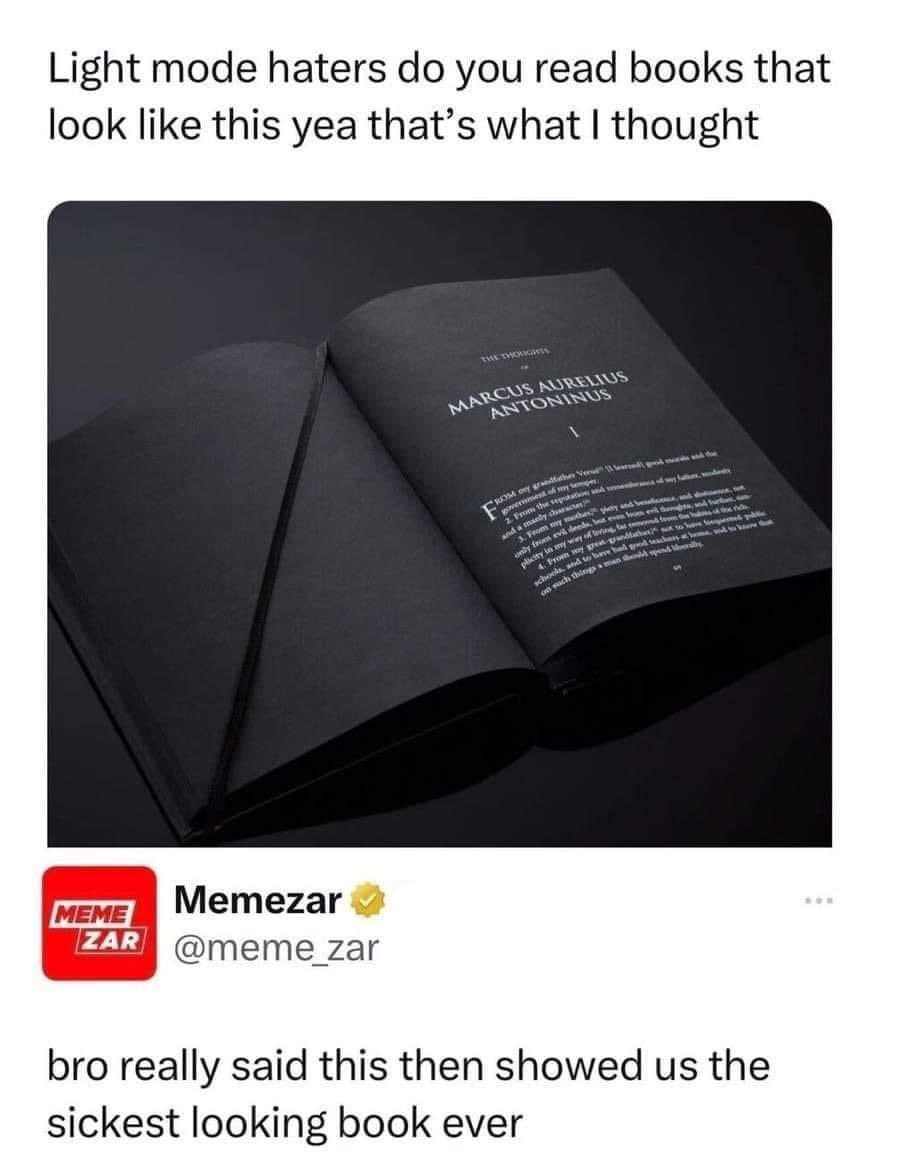
Okay where does one aquire The Thoughts of Marcus Aurelius printed on black paper because that'd be a great coffee table book.
That should be the one. https://www.monochromebooks.com/
But Marcus Aurelius is all sold out. And it costs 80$ :(
Remember, the emotional trauma you feel when you spend that $80 is just weakness leaving your body.
Our monthly subscription is nothing but a test of your restraint and tolerance to a sudden lose. It's for you to feel empowered, and, please, don't you feel obligated to thank me. I won't even roll down my new car's window to you. Alphas don't communicate verbally anyway, you should've got it by that time.
I feel it worth mentioning in response to all these comments that my liking to stoicism has nothing to do with either cryptobro bullshit or alpha male bullshit I think it's just a good healthy way of dealing with day to day life in a world that you have very little individual power to change.
Yep. Reading Marcus Aurelius was kinda funny for his thoughts weren't like reddit stoicism at all.
Gotta be one of those epicureans instead. You hang out on the street until someone offers you a steak dinner.
