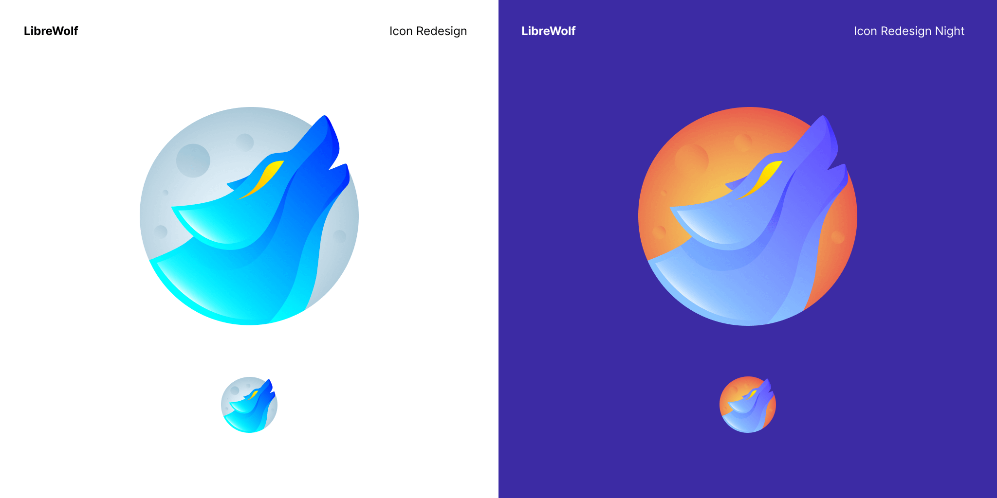
I like the moon in the background and I like that it is stylistically similar to the Firefox icon. My only complaint is the eye, not really a fan of the swoosh effect on the eye.
Agreed. I don't like the eye either, makes it look too edgy for my tastes. Other than that it's pretty neat.
Personally I would make the moon blue and the wolf white, that way it still kinda looks like the original icon while being more modern.
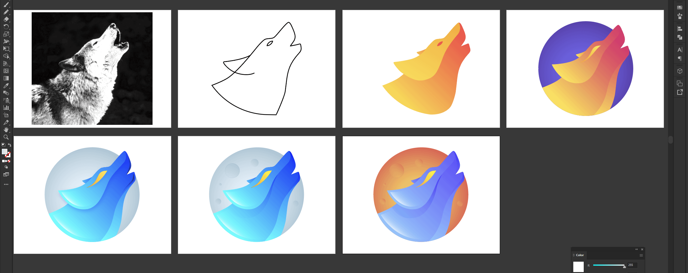
We can agree the actual LibreWolf icon is kinda basic,this looks really good and i wanted you guys to see it too! the download link is: https://drive.google.com/file/d/1z3IlSucvao6D7QDWTN5sCBRNR-6ub9s5/view?usp=sharing