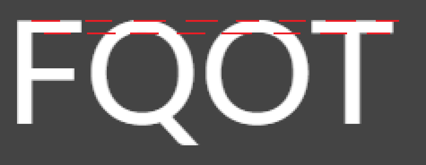
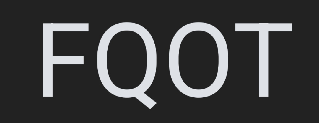
Today I Learned that letters with round tops (Q, O, S, etc.) are drawn a smidgeon higher than letters with flat tops (E,T,F, etc.). This 'overshoot' makes them appear equal to our perception
Open link in next tab
Frere-Jones Type
https://frerejones.com/blog/typeface-mechanics-001
Frere-Jones Type is a type design practice in New York City.
 :::
:::