
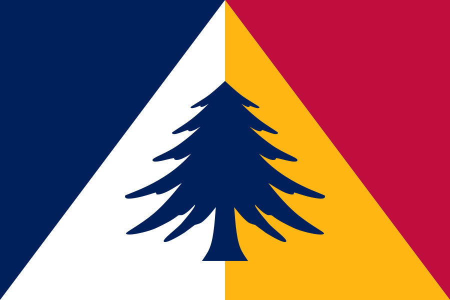
Let it fly: Minnesota officially has a new flag
Let it fly: Minnesota officially has a new flag
https://www.mprnews.org/story/2023/12/19/new-minnesota-flag-final-design
The State Emblems Redesign Commission made its final edits to the new state flag. The banner will go up in May unless lawmakers intervene.

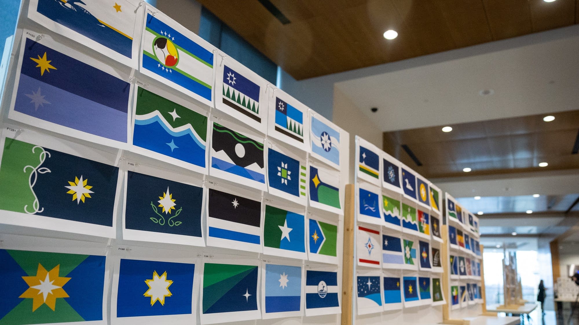
Commission selects a final concept for the redesigned Minnesota state flag
Commission selects a final concept for the redesigned Minnesota state flag
https://www.twincities.com/2023/12/15/panel-selects-final-concept-for-minnesota-flag-design/
The design has a number of variations, and the panel will meet again next week to settle the final details.


What are your thoughts on complexity in flag designs?
There are a lot of varying opinions on how complex flags should be. Some prefer that flags be kept more simple and minimal, and others feel that simple flags come off as bland, corporate, and unflaglike. What do you think?
My take is that complexity on flags can be great given the following:
- Complexity is used to make a specific a focal point stand out. Flags aren't paintings and shouldn't be littered with complex designs. Instead, the complexity should be focused in the flag's device.
- Complexity is in shape, not in color. If a flag has 6 different colors in its device, it just ends up feeling cluttered imo.
- Complex images are unique and symbolic. In general, devices should be symbolic, but imo both it and distinctness is especially important if you're going to draw extra attention to it with a complex design.
One of my favorite flags, the flag of Bhutan, does all of these with its black and white dragon.
Nevertheless, I don't think flags being minimal or following more modern design principles makes them soulless and corporate. Simple designs can look great, and I honestly tend to prefer them. Just because logos tend to use more simplistic designs doesn't mean flags can't either.
The 6 finalists for Minnesota's new state flag
They’re here! See final 6 design candidates for new Minnesota state flag
https://www.mprnews.org/story/2023/11/21/theyre-here-see-final-6-design-candidates-for-new-minnesota-state-flag
The State Emblem Redesign Commission is set to reconvene next month to choose a new state flag and seal. The panel found six flag and five seal designs Tuesday that will move on.


