Alternative to buymeacoffee
Thanks for the recent 0.3 update!
This app is awesome and I want to support it, but I can’t use buymeacoffee because I don’t have a credit card.
Also curious when there will be an official AppStore release, since this app is pretty solid.
The only thing missing for me personally that I can think of are really minor customization options (like hiding voting arrows in feed/post view since I use gestures or the ability to collapse posts. Like the stuff we got used to by using Apollo.), but else Arctic rocks and I really love the smoothness and polished design.

Search inside a community?
Search inside a community?
Thanks for the enhanced search tab, but I noticed that you can not search inside a community or am I missing something?
Change alignment of info widget icons based on the widget’s placement
Change alignment of info widget icons based on the widget’s placement
The info widget looks a bit out of place when it is moved to the left or right side, since its icons are always center-aligned.
Could you implement that the info widget icons are automatically left-aligned when the info widget is moved to the left side, and right-aligned when it is moved to the right side?
Or a manual way to chose their alignment.
Feature requests
Feature requests
- grey text (easier on the eyes, especially in night mode at night); like post preview text in feed
- full height posts without post preview (headline view is too small)
- compact posts setting for general post view/display; similar to compact comments (community and user name only 1 line instead of 2, smaller avatar image, …)
- mark as read on scroll/open
- remember settings (post view size, show/hide read) per community
Thanks for all your work, these are just a few suggestions.

CELEBRATE 8 YEARS OF ROCKET LEAGUE WITH BIRTHDAY BALL!
CELEBRATE 8 YEARS OF ROCKET LEAGUE WITH BIRTHDAY BALL!
Open link in next tab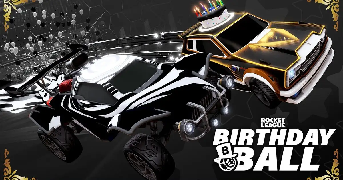
Celebrate 8 Years of Rocket League with Birthday Ball!
https://www.rocketleague.com/news/celebrate-8-years-of-rocket-league-with-birthday-ball/
Happy Birthday to us! Earn Birthday Ball Challenge rewards, get black-and-white Item Shop content, and play the Super Cube and Beach Ball LTMs.
App customization
App customization
Thanks for all your work with the new update!
I currently have “show community icons” disabled, but they are shown in my feed, but don’t shown in the compact view at all no matter what I select.
Will you add/update customizable settings in the app and add new ones in the future? The new update made the UI a bit busy for me with all the colours and buttons, it would be awesome to be able toggle UI elements like in the first version of the app, eg disable the big voting buttons (only colour the counter).
I would also suggest moving the comment counter next to the voting counter instead of next to the comment time and moving the buttons (share, save, …) behind the ellipsis button, like Apollo.
The current comment view feels a bit overloaded but compressed compared to the previous view, where you had one section for comment text and one section for the meta (account name, voting, time, …). That moves the focus from the actual comment text to all the meta and buttons. Now you have a section with username and time, a section with comment text and another section with comment meta buttons; compared to the previous minimalistic approach of Mlem.
The entire r/MildlyInteresting mod has just been REINSTATED - again without any communication or explanation
The entire r/MildlyInteresting mod has just been REINSTATED - again without any communication or explanation
Open link in next tab
Reddit - Dive into anything
https://reddit.com/r/ModCoord/comments/14etdf8/the_entire_rmildlyinteresting_mod_has_just_been/