
It's supposed to go away when scrolling down. It only pops up again if you're scrolling up, but then you'd be looking at the top of the screen anyway.
Joke's on you: Those extra miles required extra energy so we're burning more calories a day than the bottoms.
I got my pc hooked up to a 4k tv like a normy, so it just works and looks better to have start up top but also having the browser bar up there is too much
Top. Always top. That's where all the tools I need for an application should be. Bottom area is for system tools.
It keeps things nicely separated, less risk of fat fingering something I don't want to hit.
yeah, let's just put all the important tools in the hardest to reach spot on the screen
top makes sense on desktop, but on phones bottom is just logical. took way too long to get to it already because of the exact notion you expressed
Good point
It isn't
I'm honestly just lonely, slightly horny and very confused about who I am
Yeah, true. Best thing you can do is pretend, until you don't have to pretend anymore. One could say fake it, til you make it.
I like you guys, gals and nonbinary pals, you're all so understanding and nice here.
Let me just virtually hug you real quick, if you have nothing against it.
top bottom is just unnatural the browser bar belongs at the top and anyone who puts it at the bottom should be put down like the dog they are
I agree with the placement of the toolbar. You may wanna cut your coffee intake just a bit. You seem a bit hyper on the trigger
Definitely the top, otherwise I am misclicking the tooolbar.
But also, I am mostly a landscape smartphone user. Which is why I'd prefer 16:9 instead of whatever the hell this wide thing is. But with bezels. You can hold onto a bezel with thumb. Also a separate navigation button like I had on my Moto G5s Plus 🥰.
Also permanently enabled Desktop mode on browser.
But I also increased minimum width in developer settings from default 395dp to 705dp. 600dp and above is considered a tablet by apps. Fits so much content on 1 screen.
Is it comfortable? From my experience landscape suffers from issues like the ui taking up a lot more screen space and the keyboard being hard to use.
That depends on what apps you use. But for example YouTube app in tablet mode looks nicer in landscape:

In phone mode you can only view comments/live chat in portrait mode.
In tablet mode, this is often the other way around. Some comparisons:
Google Photos
Phone mode:
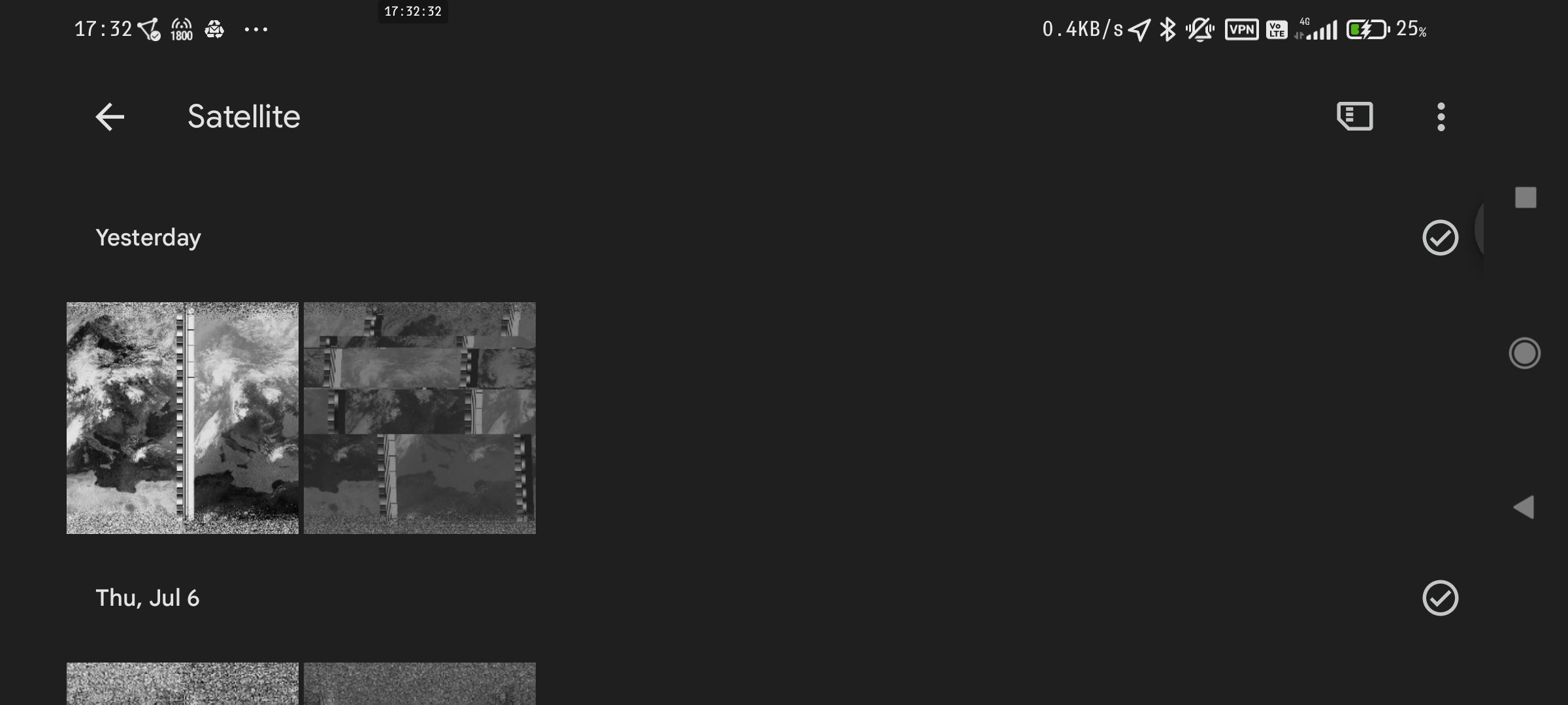
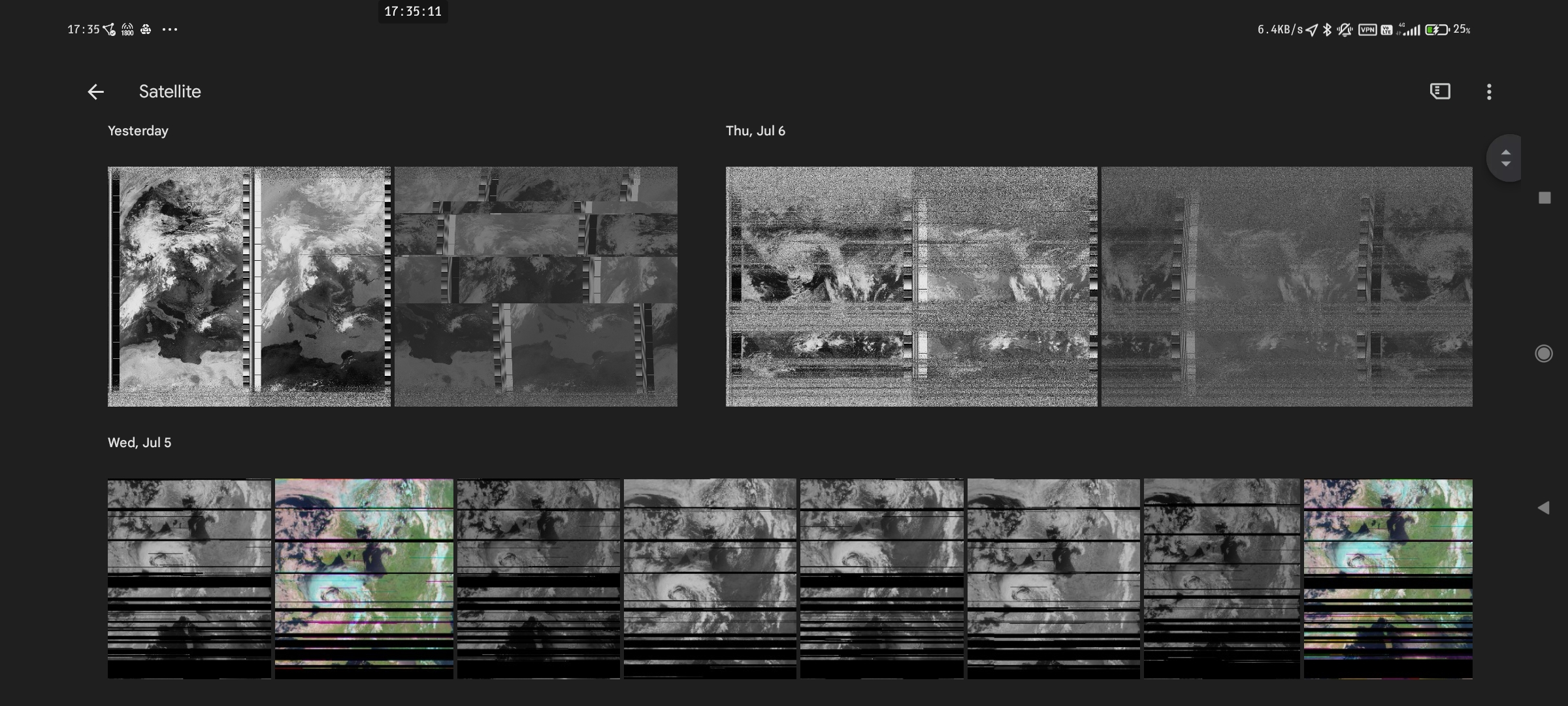
Tablet mode:
YouTube
Phone mode:
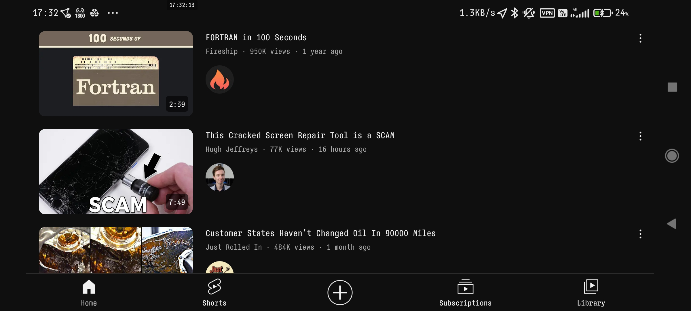
Tablet mode:

Google Mail
Phone mode:
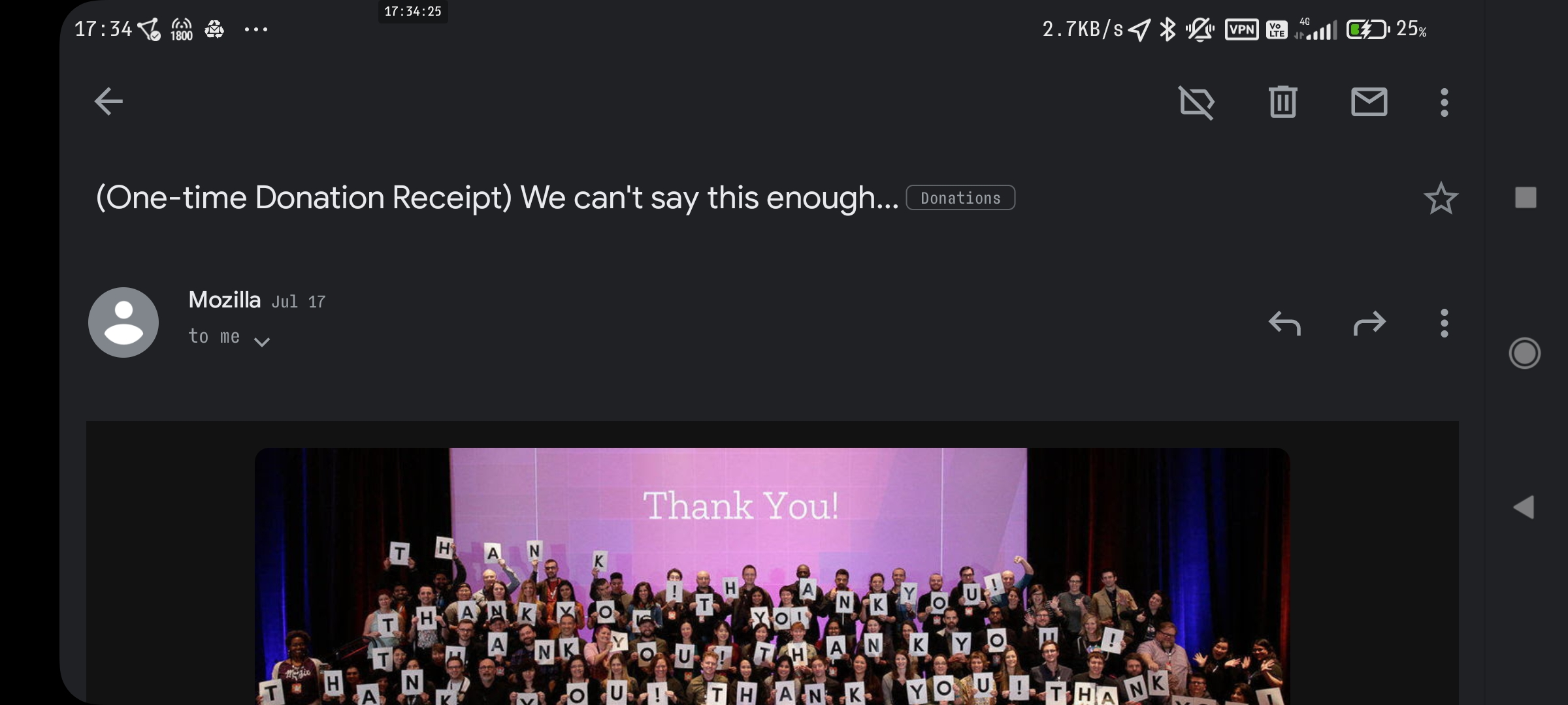
Tablet mode:
etc.
I mean, if your phone is a >6" monster, tablet mode makes sense... (I can't stand modern phones without replaceable batteries, bezels and a tactile Home button)
I think all phones above 6" are oversized. I would prefer a >5mm thick 5" 16:9 phone to any made today. I use a 5.4" phone and I'm still a Firefox bottom.
Top, although it takes more travel time for my thumb or index, depending on use case, it just feels more correct that way.