Does anyone remember a logo that looked like this? None of us can place it but we all think we remember.

From the comments, I think that the general answer is: We all recognize it, because a lot of different places used a logo sorta like this in the 90s.
And we can't pin it down exactly, because a lot of different places used a logo sorta like this in the 90s.
And being the 90s, a lot of that was never on the internet in the first place.
It rings very strong bells for me, and I don't think the reason is one that (at the time of this comment) has already been posted... But I can't for the life of me remember what it was for.
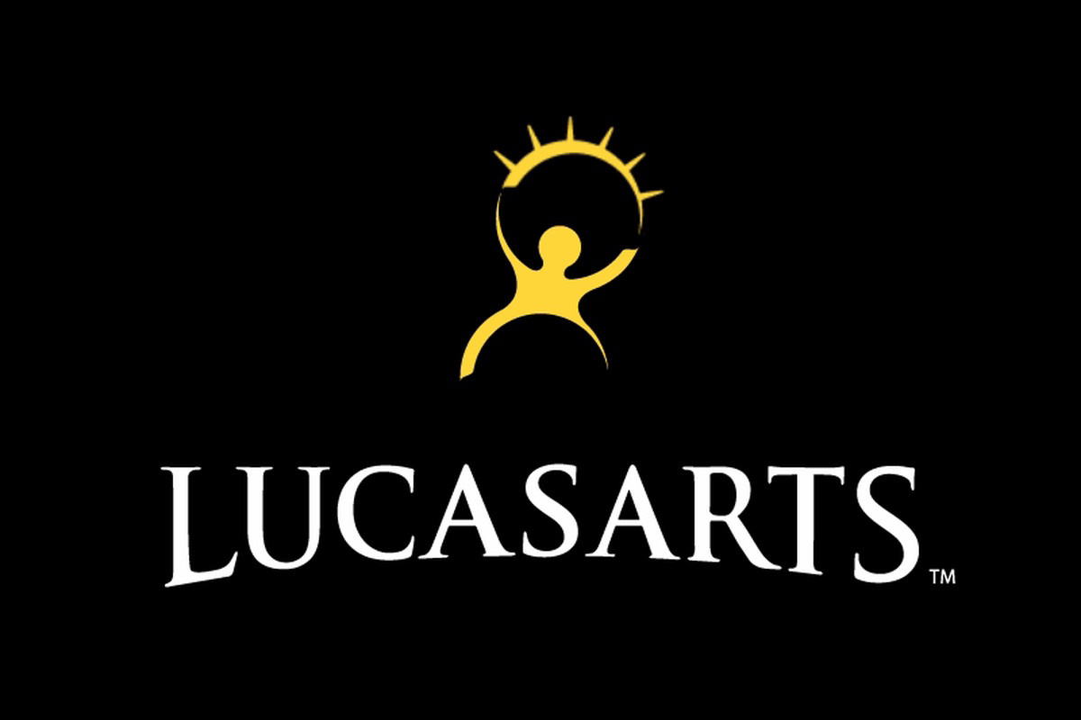
Reminds me of the old LucasArts logo but that wasn’t stars, it was a sun or the top of an eyelid with lashes.
It's a charity of some kind I think, or some kind of educational thing. Can't remember if it's 90s or 2000s.
I’m getting a similar vibe. Maybe a PBS/Edutainment production company whose logo popped up in the post credits?
Or the logo of some publishing company that showed up on their worksheets or handouts? A standardized test logo?
I was thinking like a heart healthy, ad council type thing that was put on cereal boxes.
I think this is what I was thinking of.

I think this type of logo was commonly used in the 90ies early 2000, but with slight variations. My scool's logo (in the EU) looked similar. that's why it seems so familiar to most of us.
The problem is that there are a million logos from the 90s that have the same stylized "separate head". I'm attempting to attach an image to show off some examples. While I absolutely feel like I recognize the logo you've posted, I think it could be an amalgamation of many of them.
Could it be Knowledge Adventure? I played some of the JumpStart games growing up.
I definitely remember it, but I can't place it either.
Maybe we are all misremembering the old LucasArts logo, but I could swear I distinctly remember those stars, not the burst-arc.
I feel like I remember those hips more than anything. Not sure what that says about me, but it's certainly a distinct feature from all of the logos I've found while searching for this one.
That reminds me of the old Hannaford (and other Food Lion brands) guiding stars logo. It's something they'd put around the store, particularly on shelf tags. The person looks to be running right and there are only three stars. Might explain why you remember it, but can't place it.
I distinctively remember it. Person is blue, stars are gold. Some versions of the logo had a gold band over the person.
I'm fairly sure I've seen it recently, likely at a department store.
I remember it pretty much that way too, but not recently and not at a department store. Heck, I just browsed through commemorative euro coins (no dice) because I felt it was somehow connected to Europe in the nineties...
The name Creative Arts or similar is bouncing around my brain but damn if google, bing or ddg can help.
This! I remember the colors being something like a blue background and the person in a lighter blue or a white background with a blue person. Stars were definitely separate
https://www.howellfoundation.org
https://i.pinimg.com/originals/e9/4d/87/e94d87a25f1ef459c8cc87de0d126fc1.png
Junior Jazz Dance Classes? (frequently on posts about poor graphic design/'they knew') Found here https://9gag.com/gag/ap51ZK5 (yes, I'm citing 9gag because I will not cite reddit)

I remember it being in the bottom corner of some VHS tapes back in the day. Maybe a production company?
