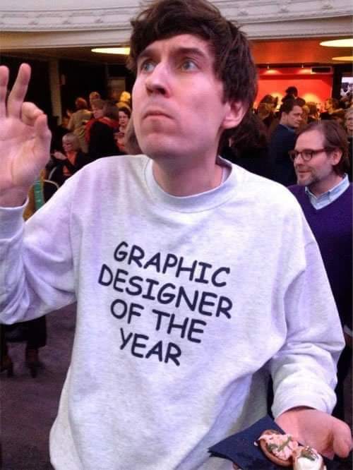
Too clean. Should’ve used multiple fonts, stretched/compressed them, and messed with the leading & kerning. Then exported it as a low resolution jpg.
And too neatly centered. And also just two colors. And also the same line-height.
This shirt was a wasted opportunity. But maybe that is a bonus? 🤔
Kasper Strömman. Graphic designer of the year 2013. It's a fun (sometimes) character bit he's doing
Here is an alternative Piped link(s):
https://piped.video/jVhlJNJopOQ?si=N6Foi3C8roz8IkGL
Piped is a privacy-respecting open-source alternative frontend to YouTube.
I'm open-source; check me out at GitHub.
Papyrus will forever be the “Ethnic font” for me. I worked as an entry-level graphic designer for some university foreign language departments and every region’s department would use Papyrus to represent their country in their material. Native American, South America, Africa, Eastern Europe, Asia, and if there was anyone that covered Australia, it would’ve been used for there too.
The shirt designer failed to use magenta color for the font with a thick neon-yellow shadow. I am disappoint
It was used by neo nazi prison gangs to identify each other well before that 4chan psyop brought it into the public consciousness.
Usually it's a white supremacy thing, but this photo predates it and this guy is just goofing around.